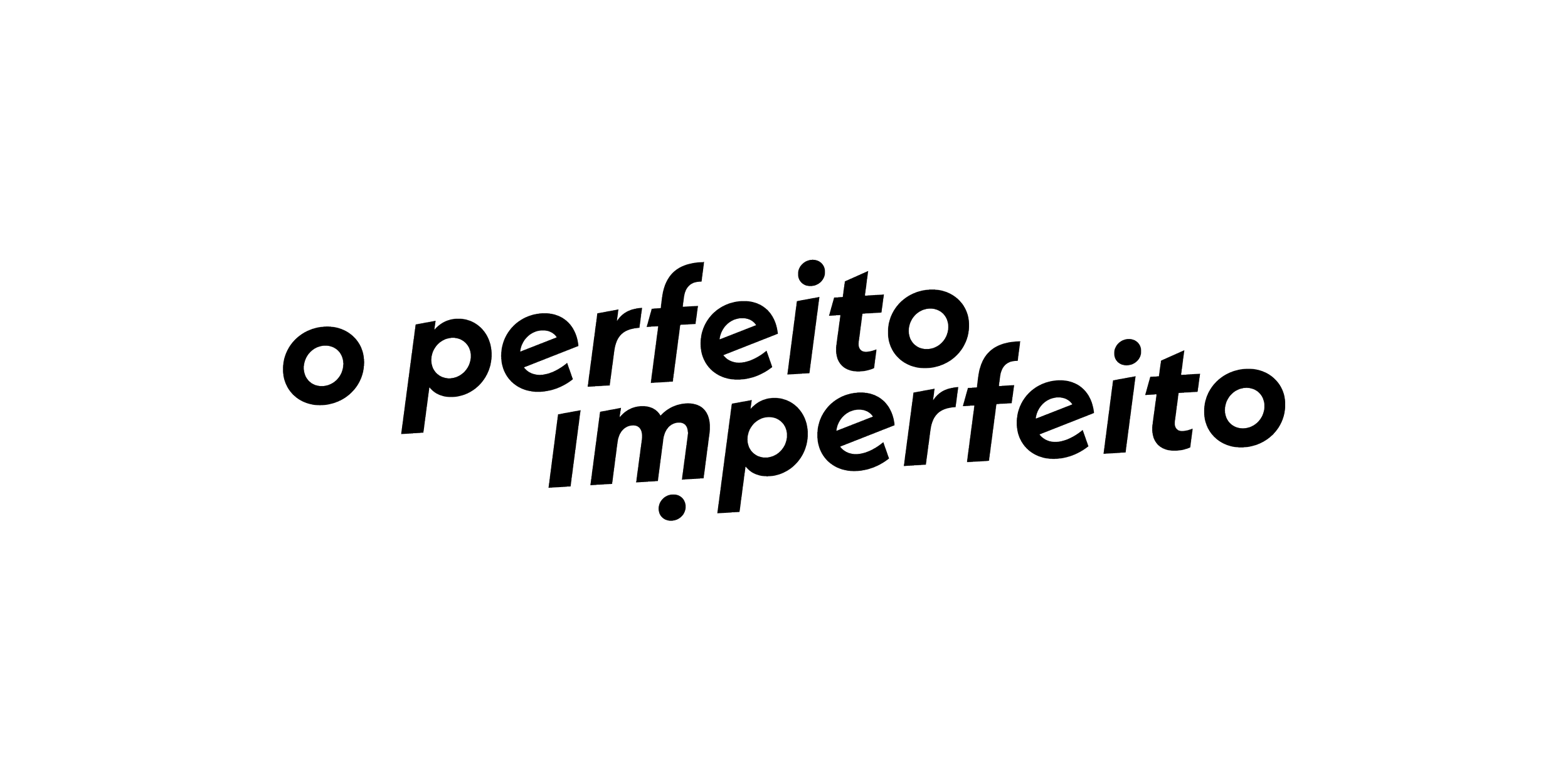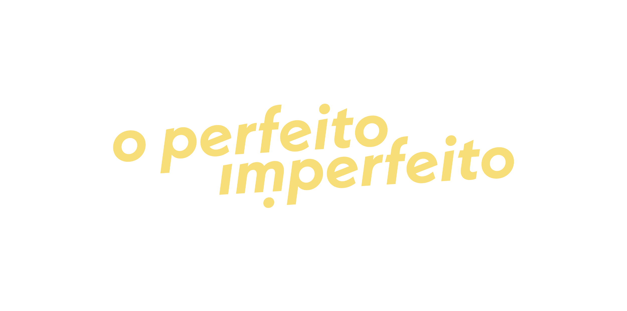
o perfeito imperfeito
Branding | Design strategy & visual concepts
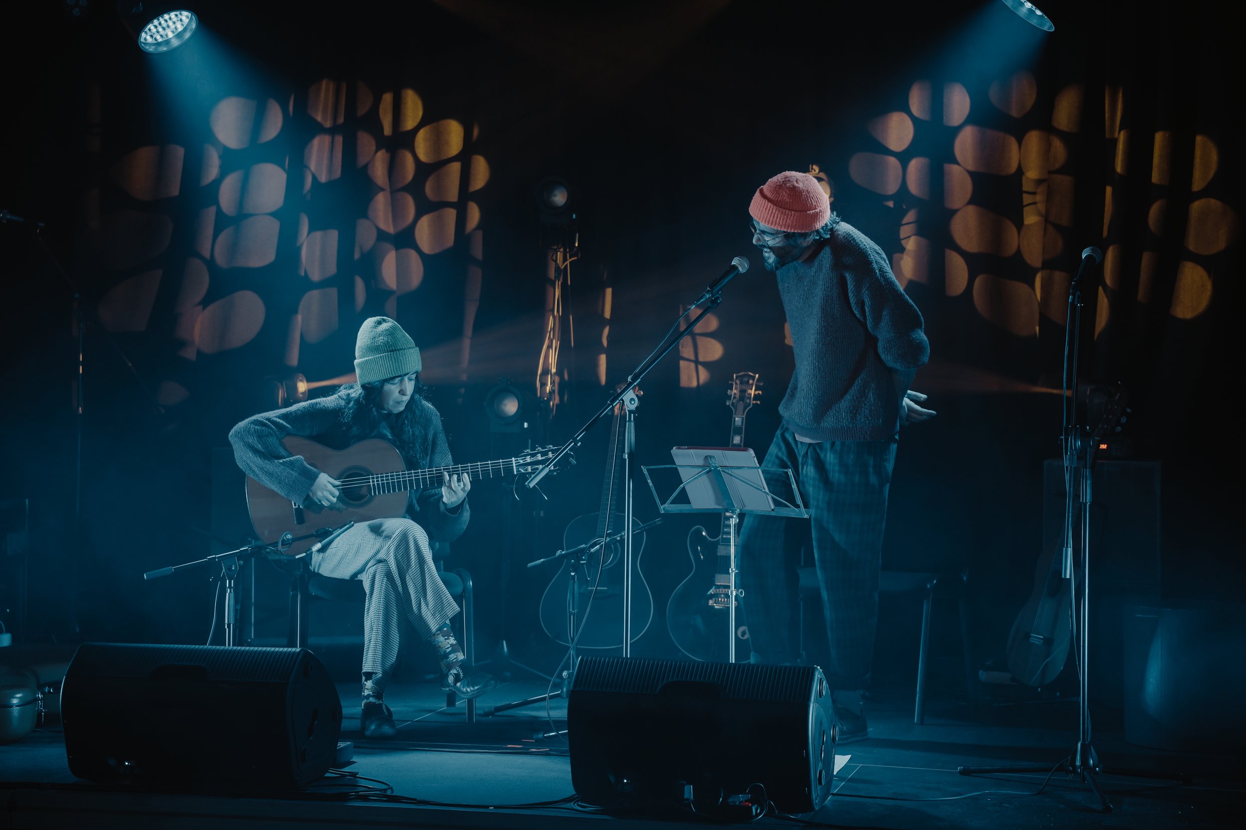
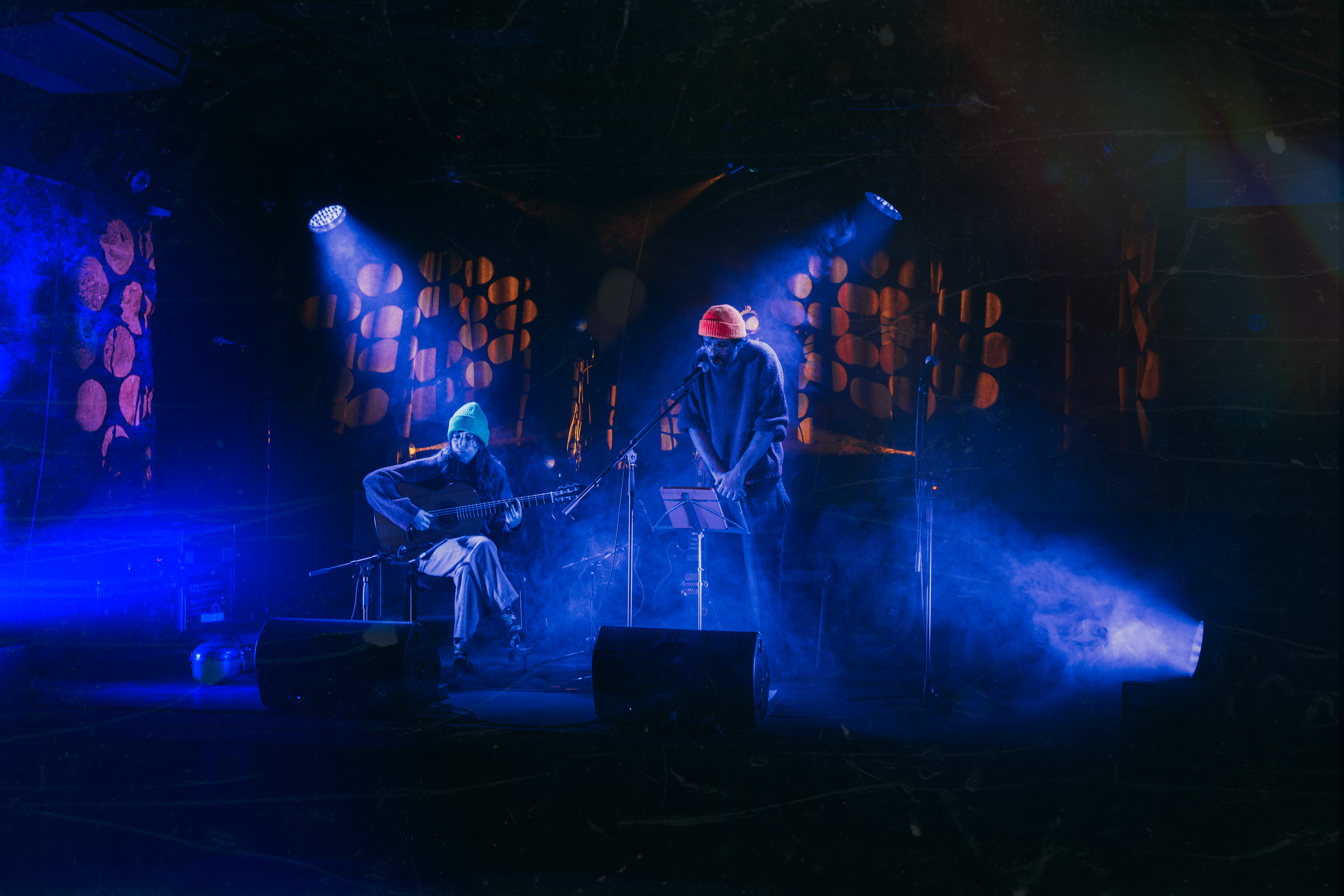
2025 Design for a musical project
The visual identity for O Perfeito Imperfeito emerges from the project's reflection on the human condition — a place where vulnerability, longing, freedom, and contradiction coexist as fundamental parts of existence. Rooted in a musical universe shaped by poetry, memory, and lived experience, the identity seeks to translate these ideas into a simple yet meaningful visual gesture.
Developed around the logotype, the identity is defined by a subtle displacement: the dot of the letter “i” shifts beyond its expected position, introducing a quiet deviation within an otherwise stable structure. Small in scale yet central in meaning, this gesture becomes a visual expression of the project's core premise — that our imperfections are not the opposite of perfection, but one of its truest expressions. Rather than symbolising error or disruption, the displaced element affirms individuality. Remaining connected to the word while existing beyond its boundaries, it inhabits the space between belonging and autonomy, order and freedom.
Influenced by a body of work that explores absence, presence, love, saudade, and the search for meaning, the visual language embraces restraint and openness. The simplicity of the graphic system allows meaning to emerge through subtle tension, creating a presence that feels both grounded and unresolved — much like the narratives and atmospheres that inhabit the project's musical landscape. Through this balance between structure and deviation, the identity reflects the spirit of the project itself: a place where vulnerability becomes expression, where singularity finds its place within the collective, and where what appears displaced is, in fact, what completes the whole.