Patrícia Pedro Afonso
Branding | Design strategy & visual concepts
2023 Design for a visual artist
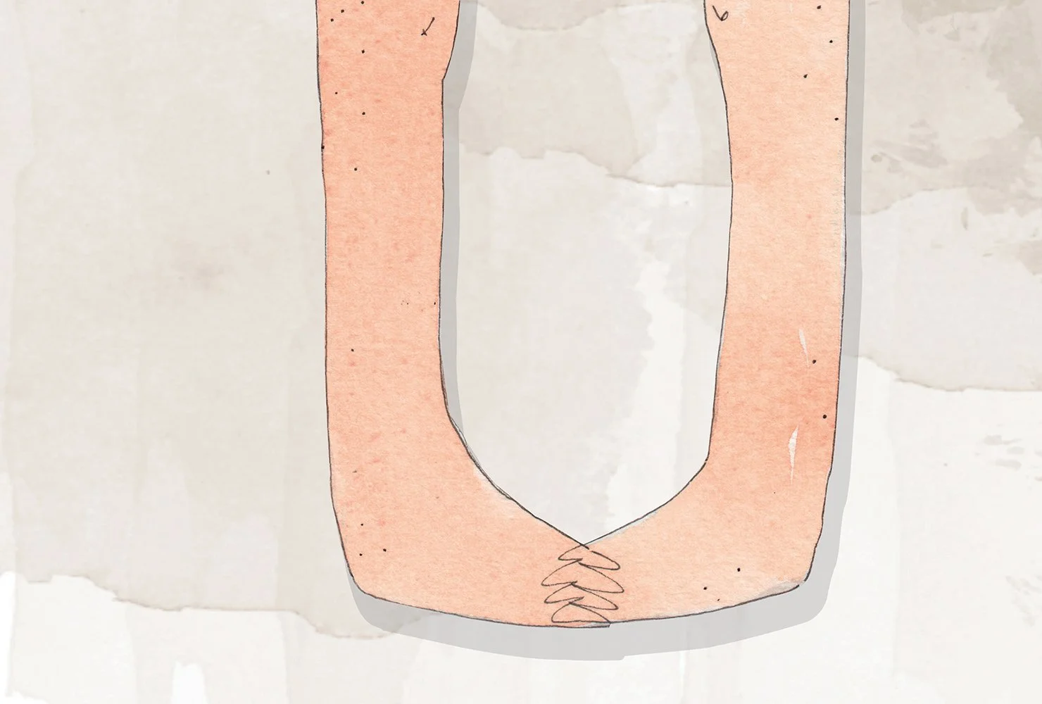
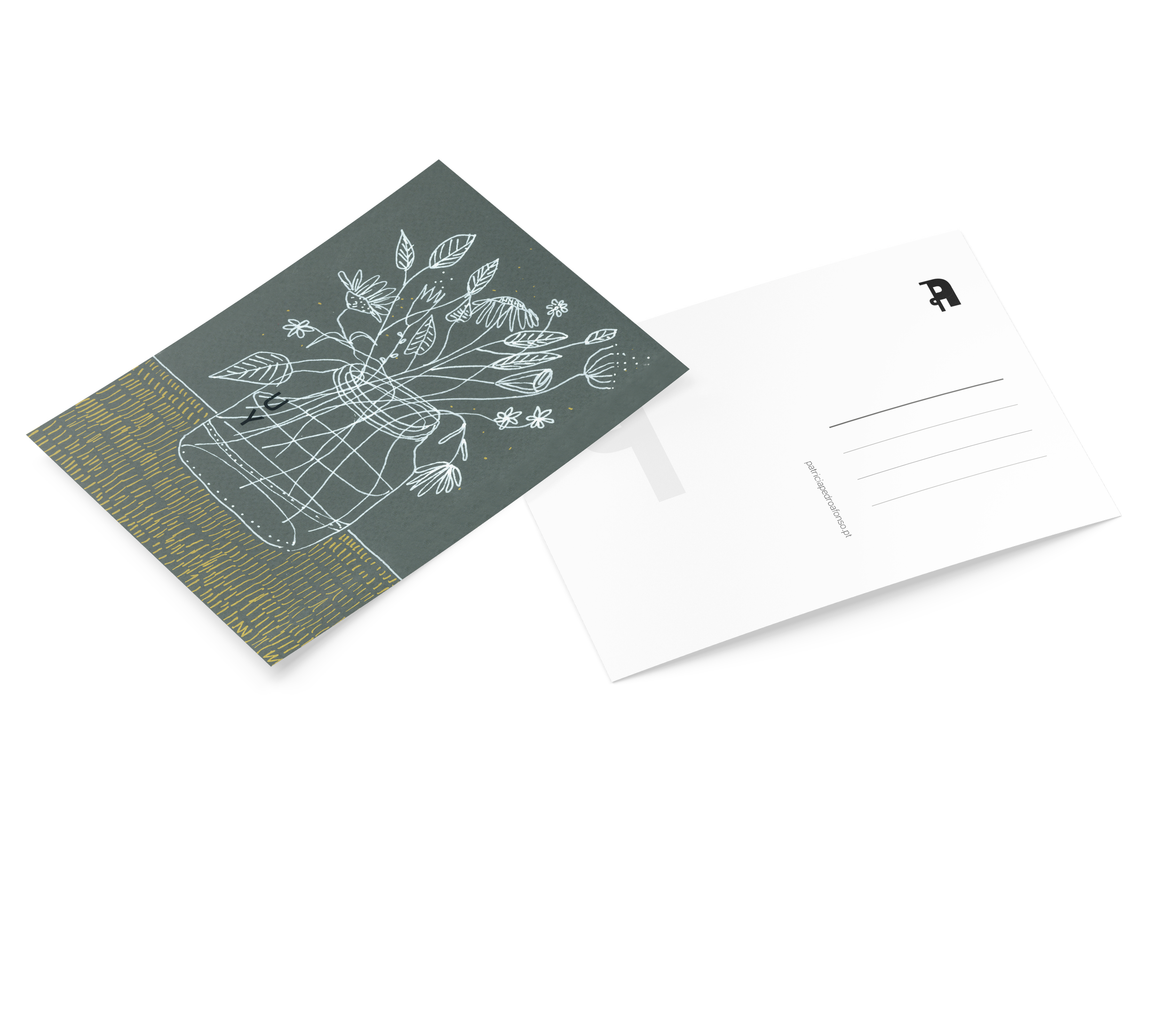
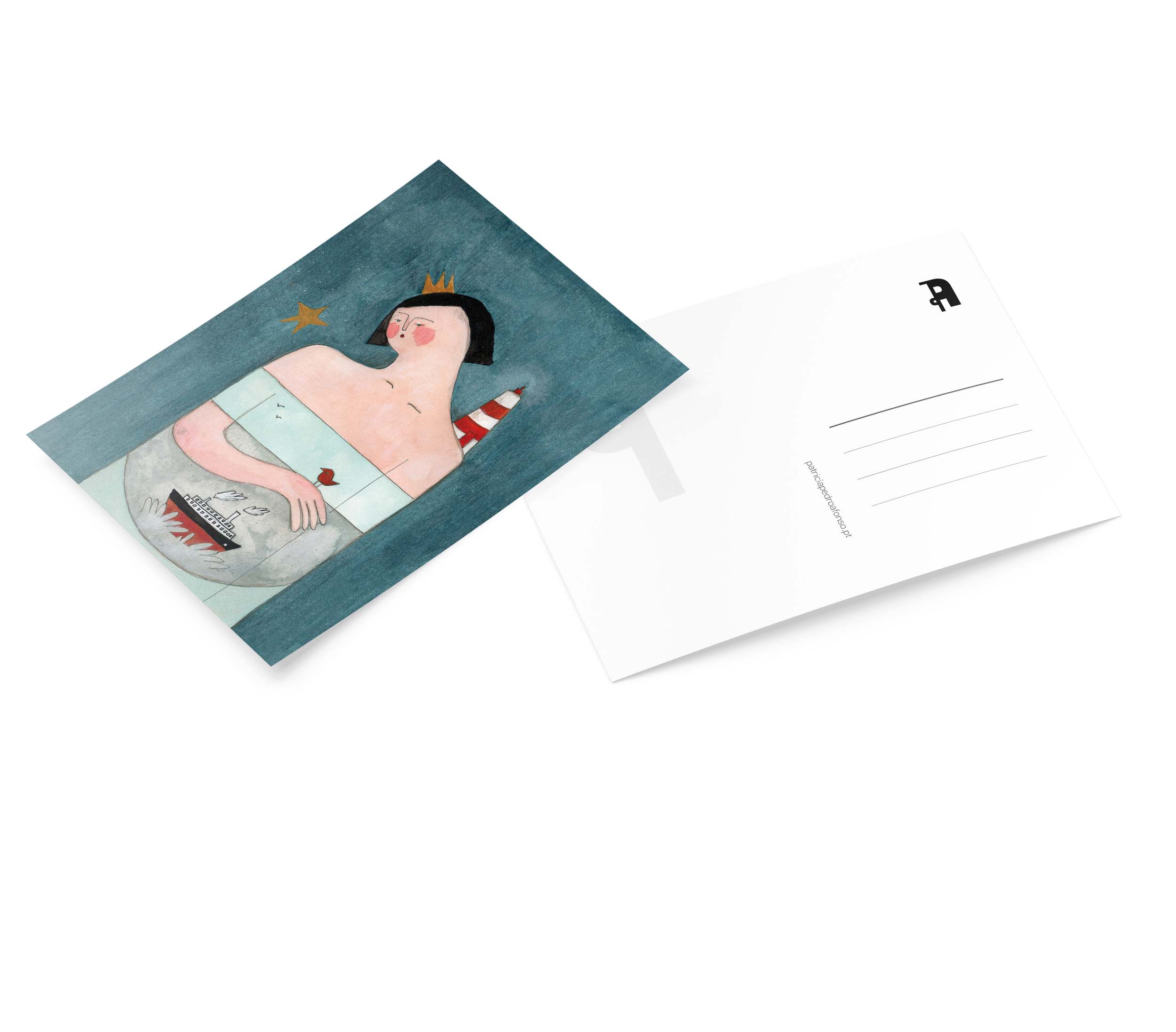
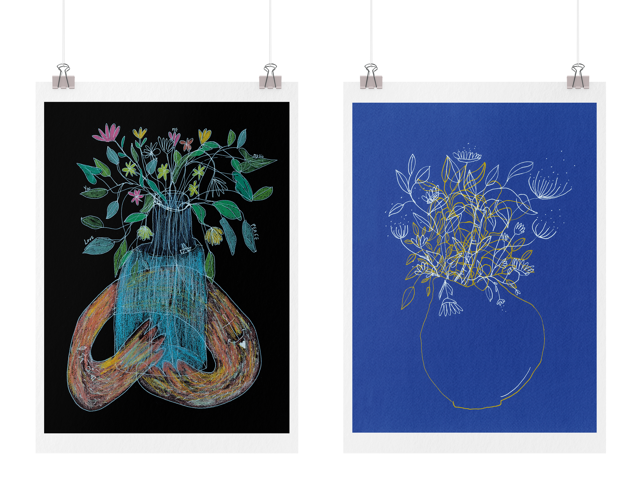
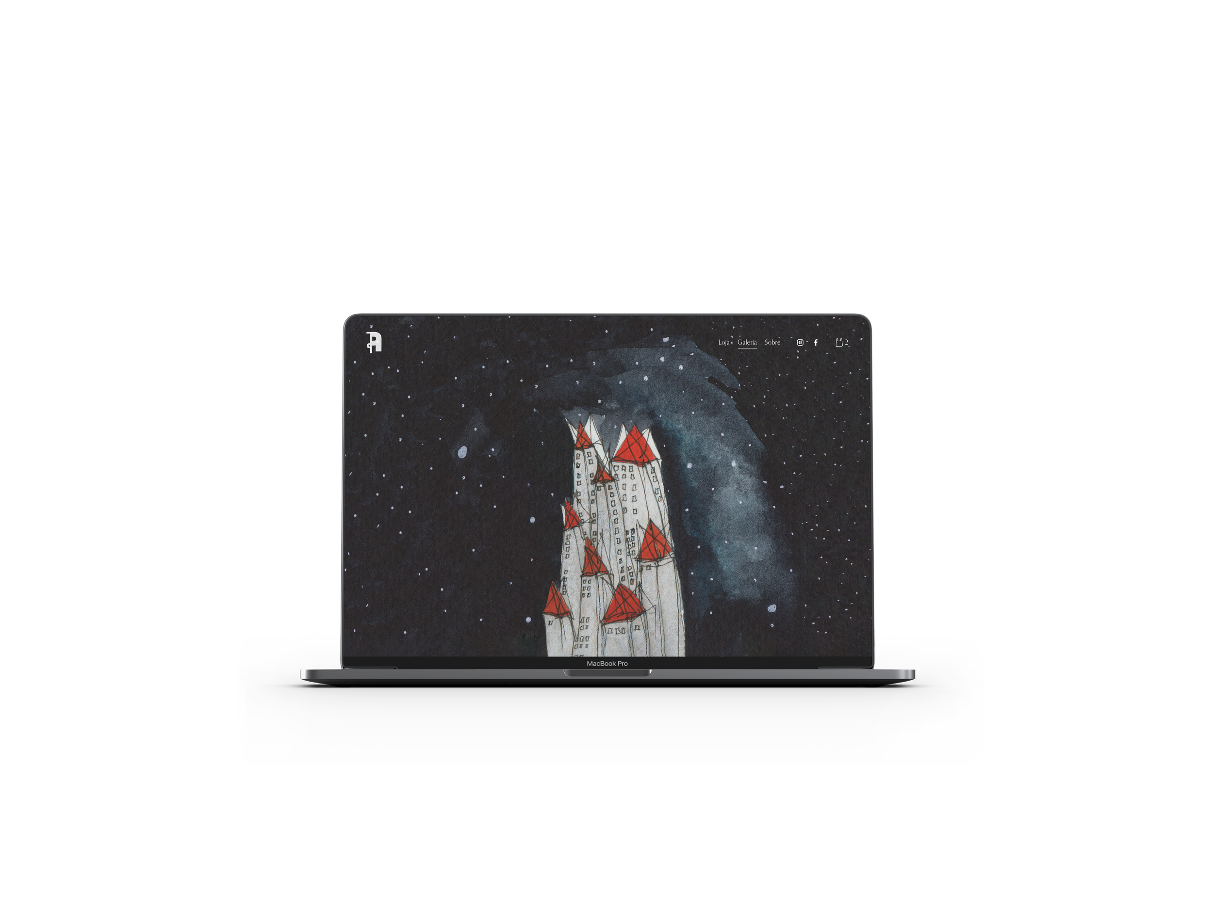
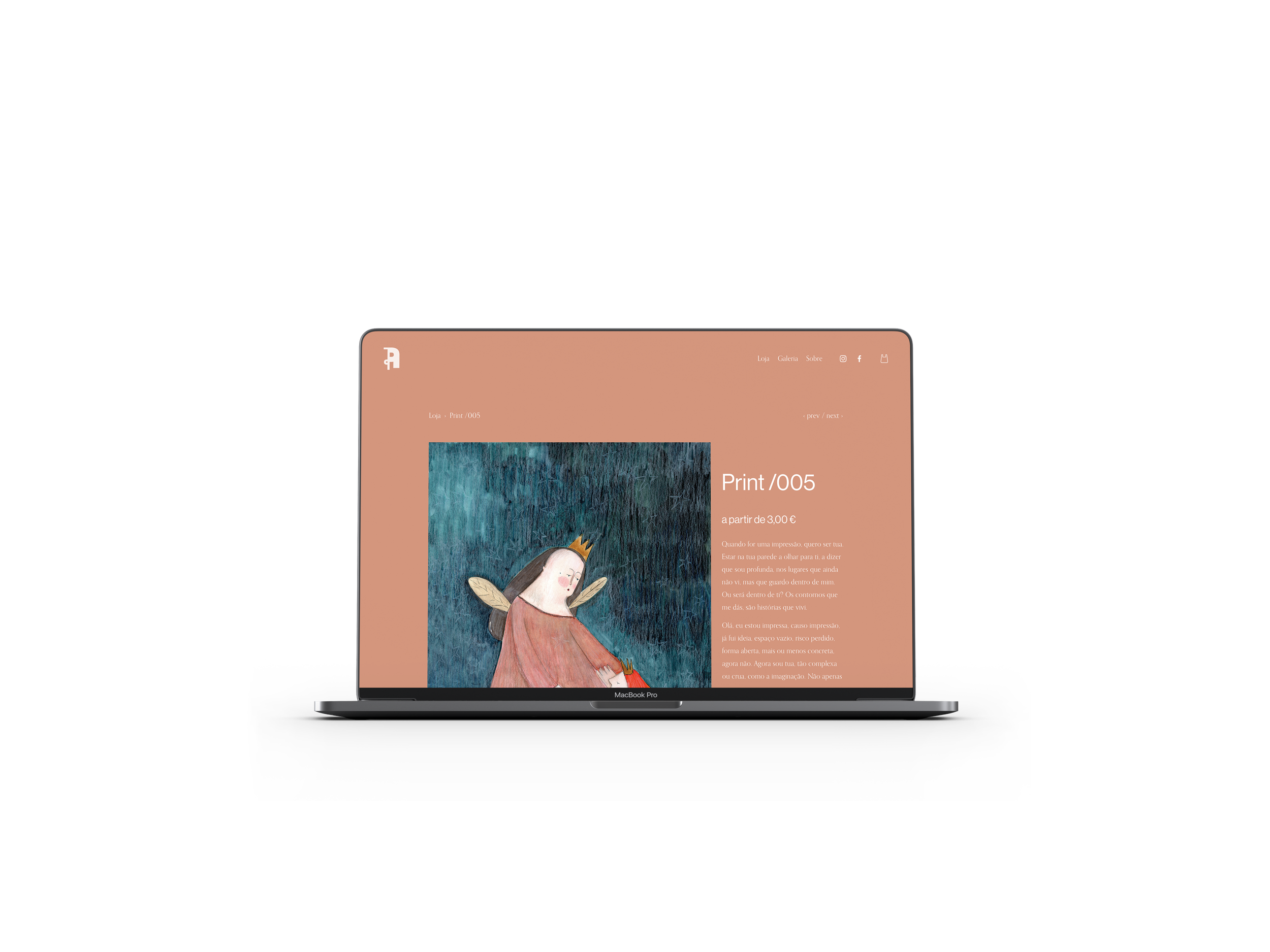
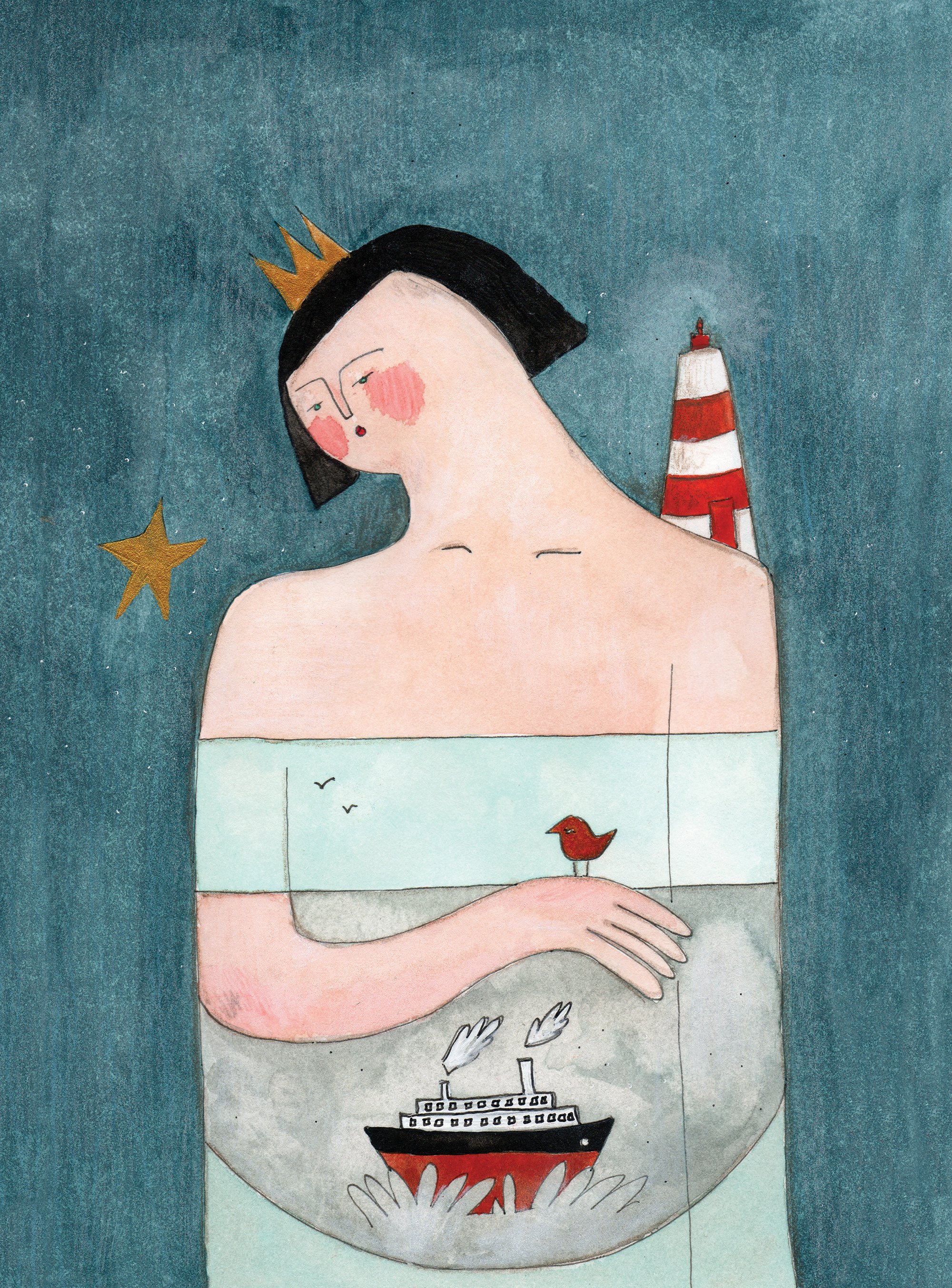
The visual identity for Patrícia Pedro Afonso emerges from the idea of unfolding - a gesture of expansion that reflects the artist’s multidisciplinary and constantly shifting practice. Developed from the initials PPA, the logotype becomes a mutable structure, capable of transforming through variations in scale, color, and composition. Rather than functioning as a fixed symbol, the identity behaves as a living system, adapting itself to the different artistic territories inhabited by the author. Performance, painting, illustration, and the creation of fictional characters and authorial objects coexist within the same visual language. This multiplicity informed the construction of an identity that embraces transformation as a central principle - where fragmentation becomes continuity, and repetition generates new forms and meanings.
Influenced by a body of work deeply connected to lived experience, memory, place, and the accumulation of everyday instants, the graphic system seeks to preserve a sense of movement and openness. In the same way, the identity unfolds through layered compositions and chromatic variations, creating a visual rhythm that mirrors the fluid and performative nature of her artistic universe. Through this balance between structure and transformation, the identity establishes itself not as a singular image, but as an evolving presence - expressive, adaptable, and continuously becoming.