Clínica
Porto Antas
Branding | Design strategy & visual concepts
2008 Design for a Medical/Dental clinic
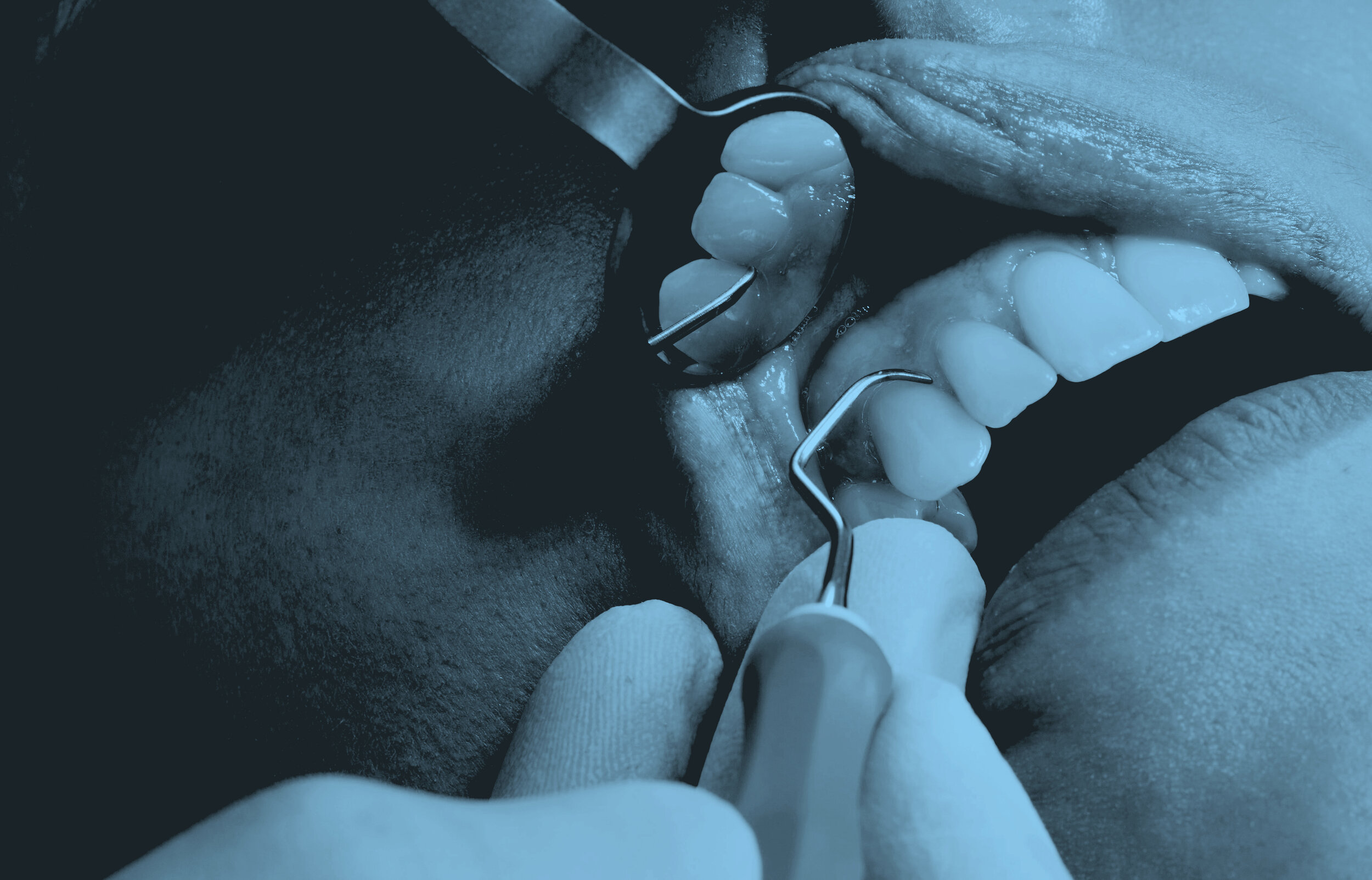
Clínica Porto Antas is a medical/dental clinic fully equipped and oriented to the practice of dentistry but where you can also find a range of medical specialties especially selected to meet the clients needs.
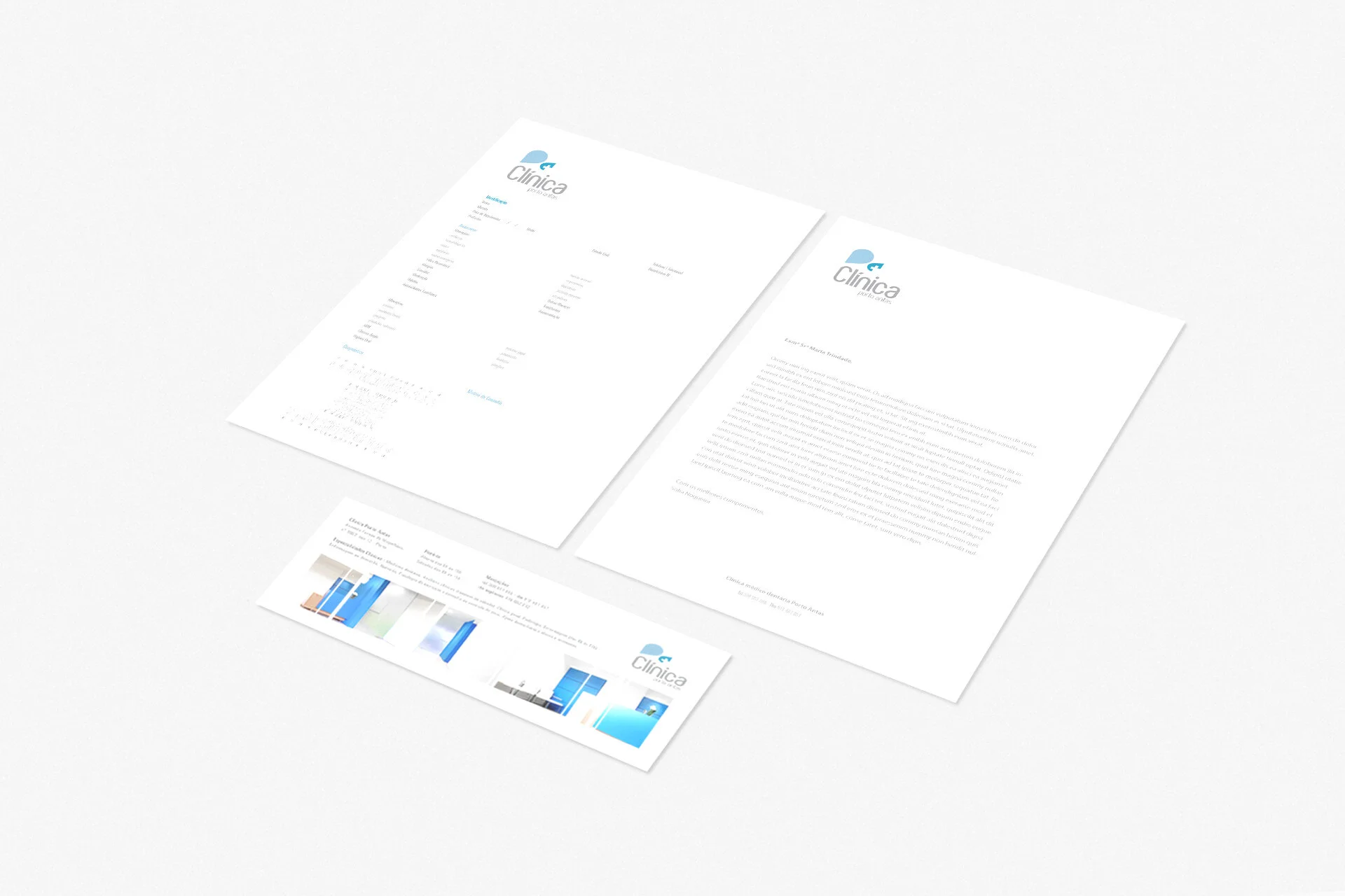
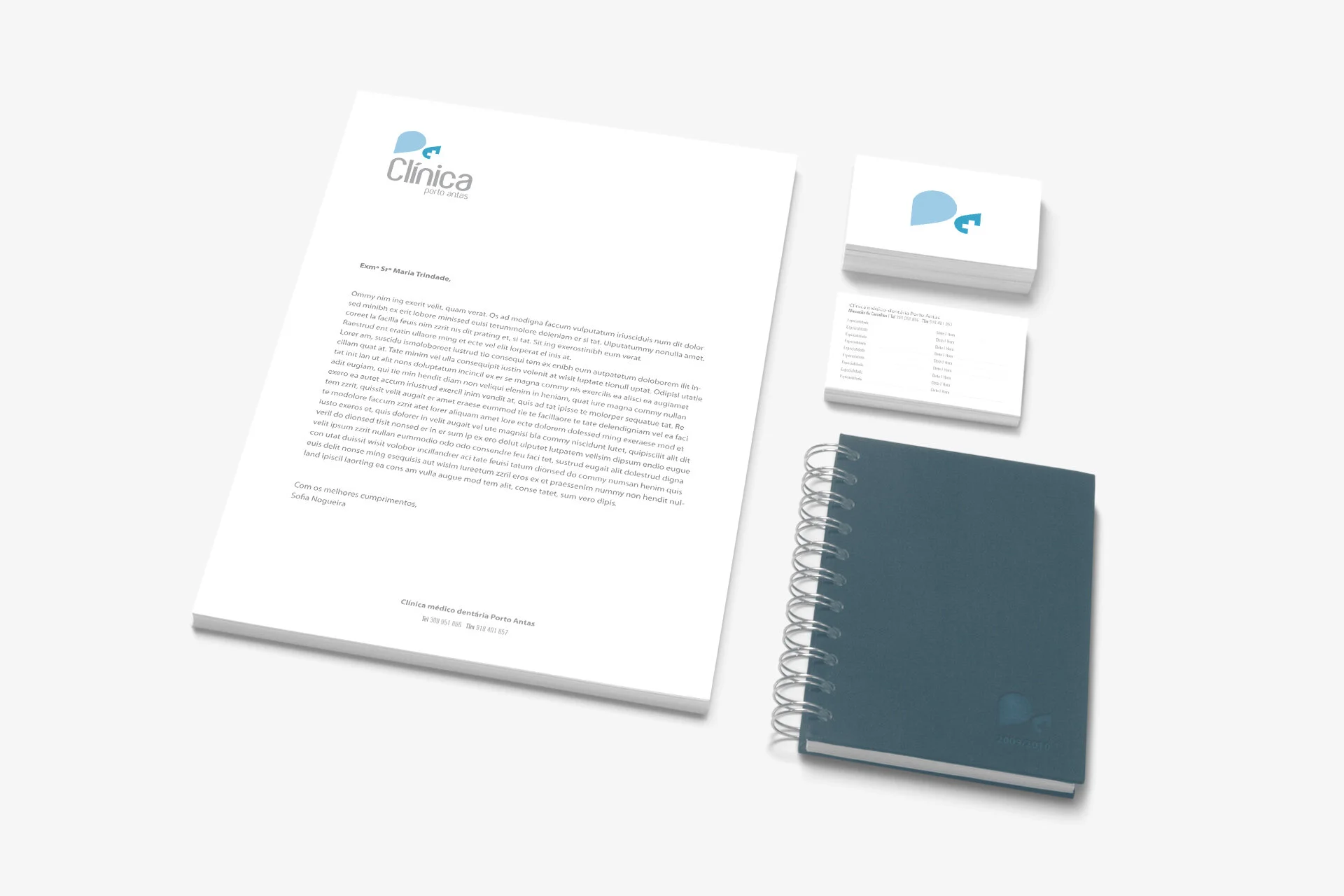
We wanted to avoid the usual symbols applied in the dental service area. However, we also wanted to portray a medical facility, not only by it’s name but with an icon of some sort. The project began with a simple typographic representation of the name of the clinic - Porto Antas. Later on, it was condensed to it’s first letters - p (of Porto) and a (of Antas). In the process of subtracting elements to make the logo more appealing and less bulky, we ended up removing the typeface completely and began working with the inner white space of the letter “a”. From it’s rotation, the “p” was born. In the end, we incorporated a symbol that we’ve tried to ignore since the beginning - the greek cross - often used as a general symbol to indicate first aid and medical services. For the clinic, we also developed business and appointment cards, letterhead, envelopes, prescription letterheads and patient record files templates, as well as indoor and outdoor signage and flyers.


